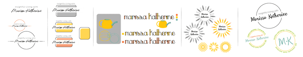
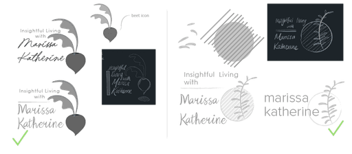
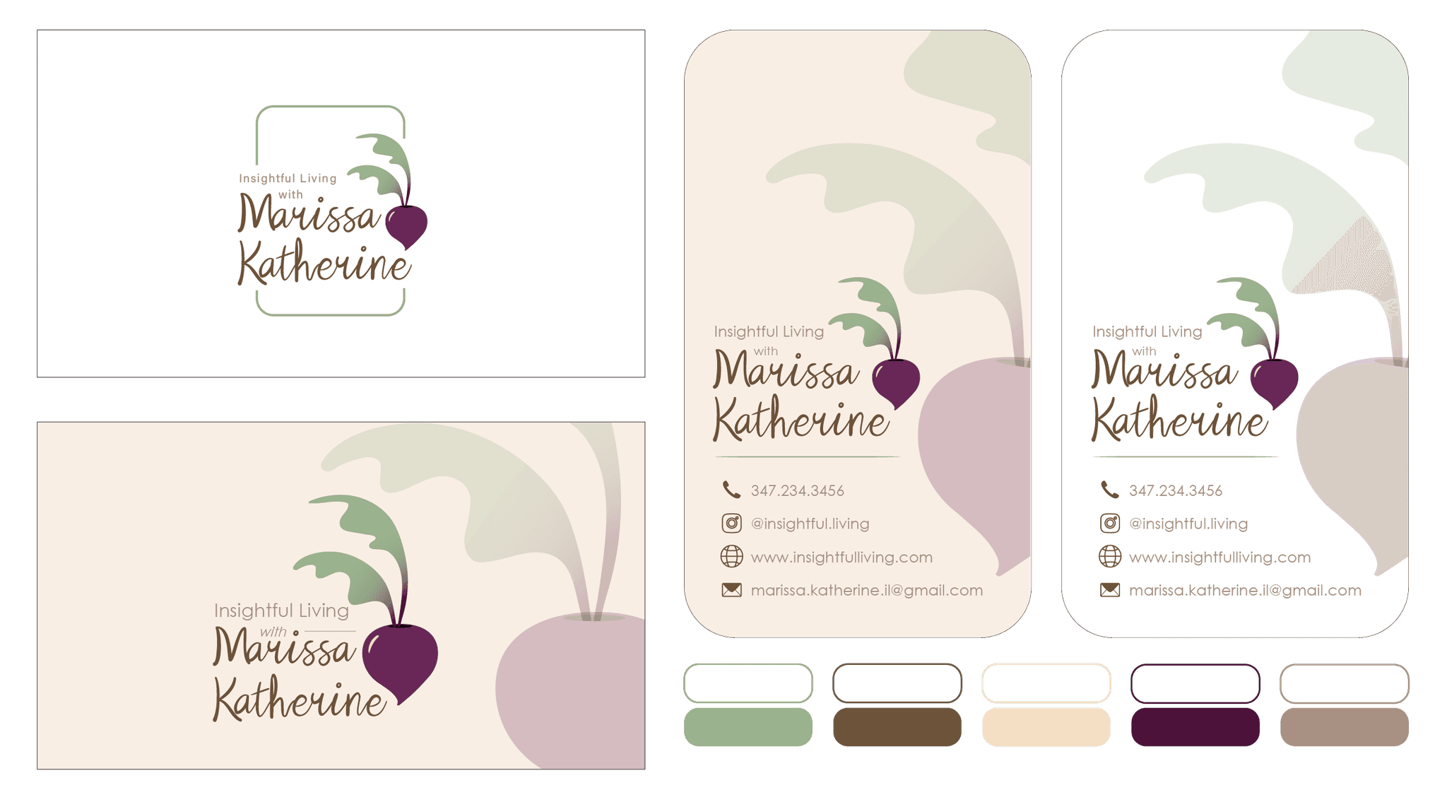
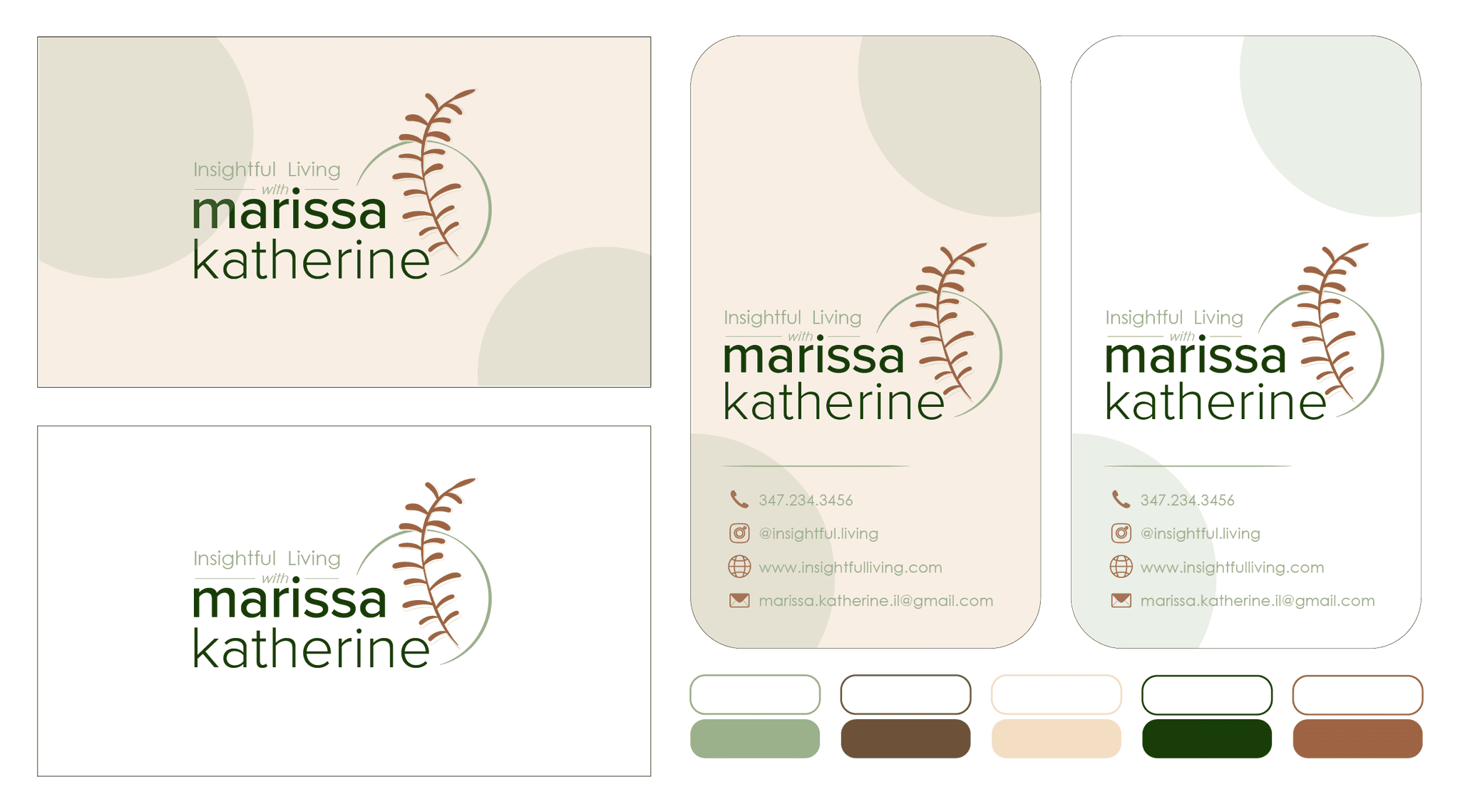
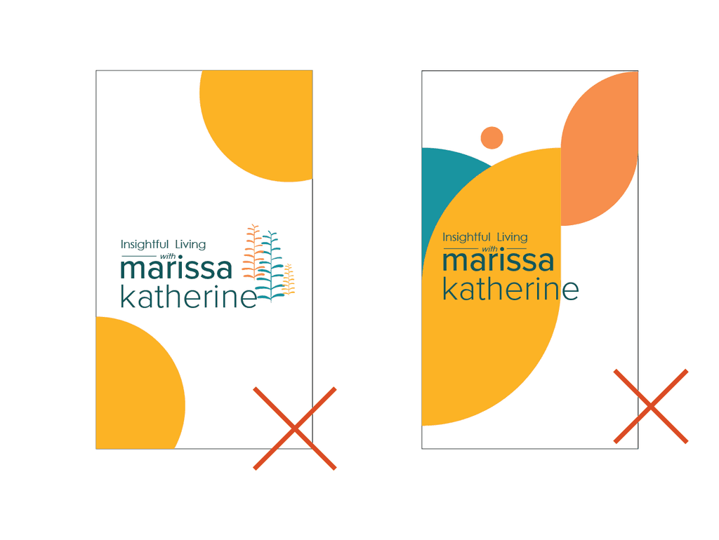
Hit or Miss?
Complete MISS!
Feedback: Muted tones were a big no-no. She realized she didn't want produce in the logo because it might mislead people that she only makes recipes and handles food.
Use more bold geometric shapes to show her personality and give a more holistic sense of the services she offers.
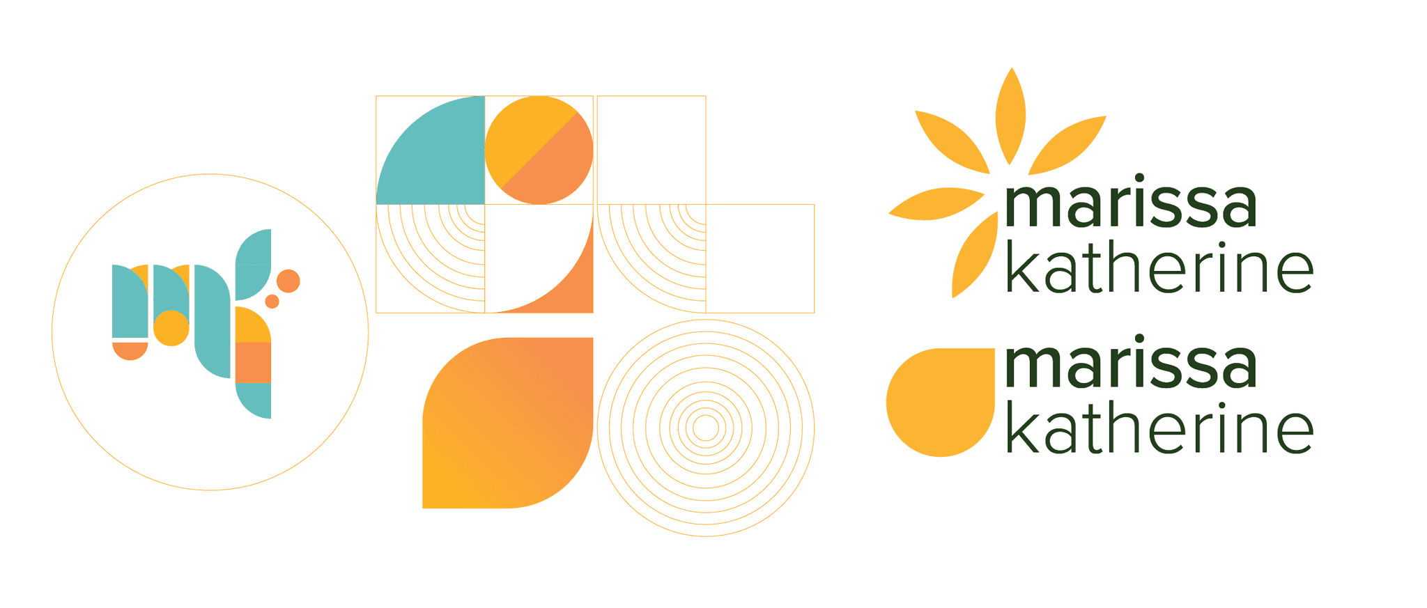
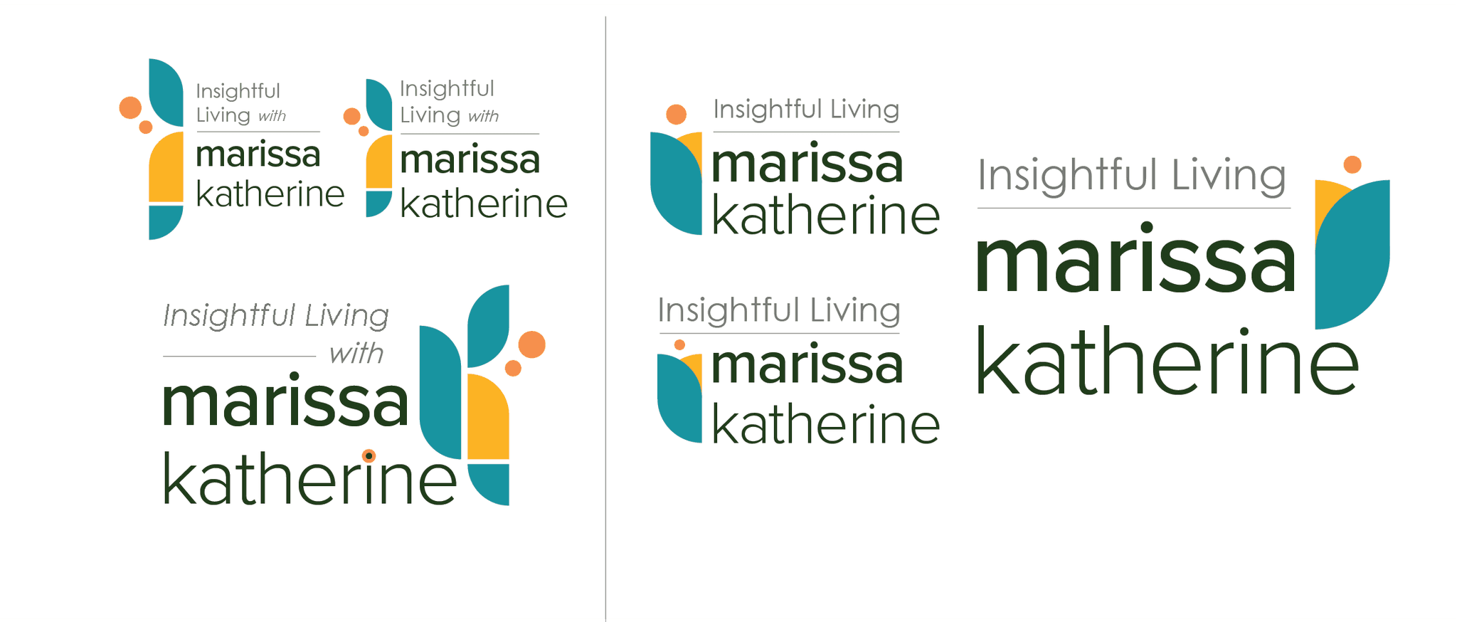
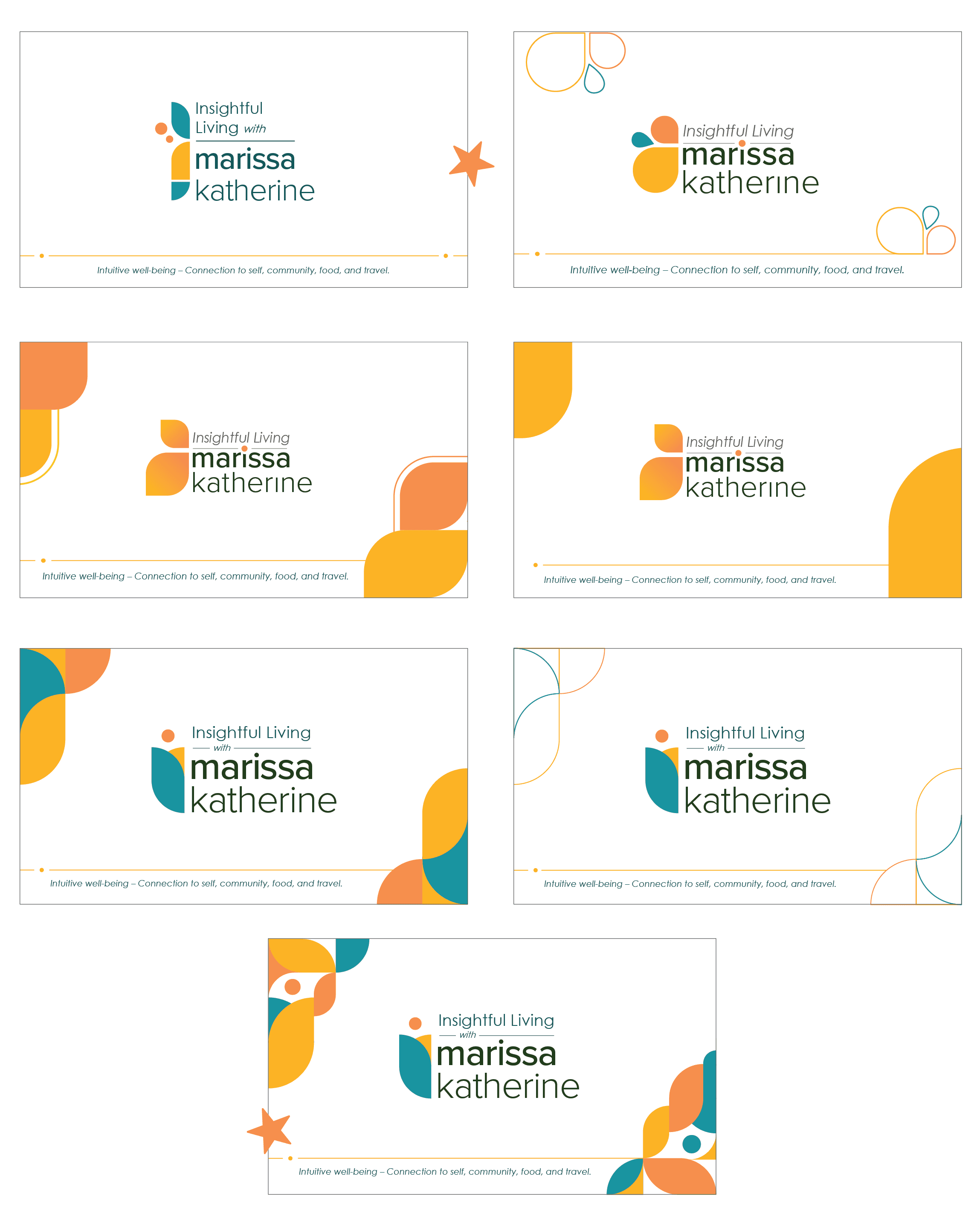
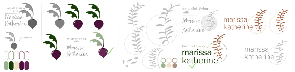
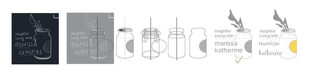
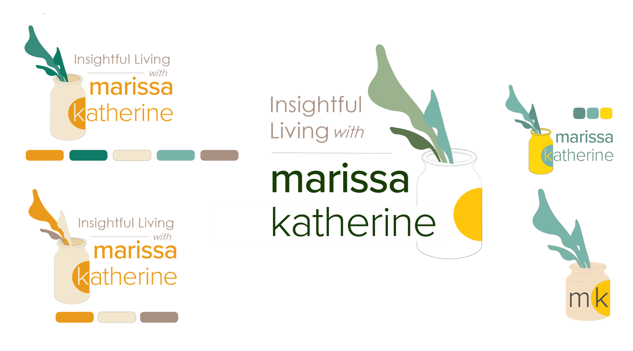
Hit or Miss?
HIT! Nailed it!
Feedback: She loved the bold geometric shapes and felt like the last logo tied everything together.